A KITCHEN WITH A POINT OF VIEW
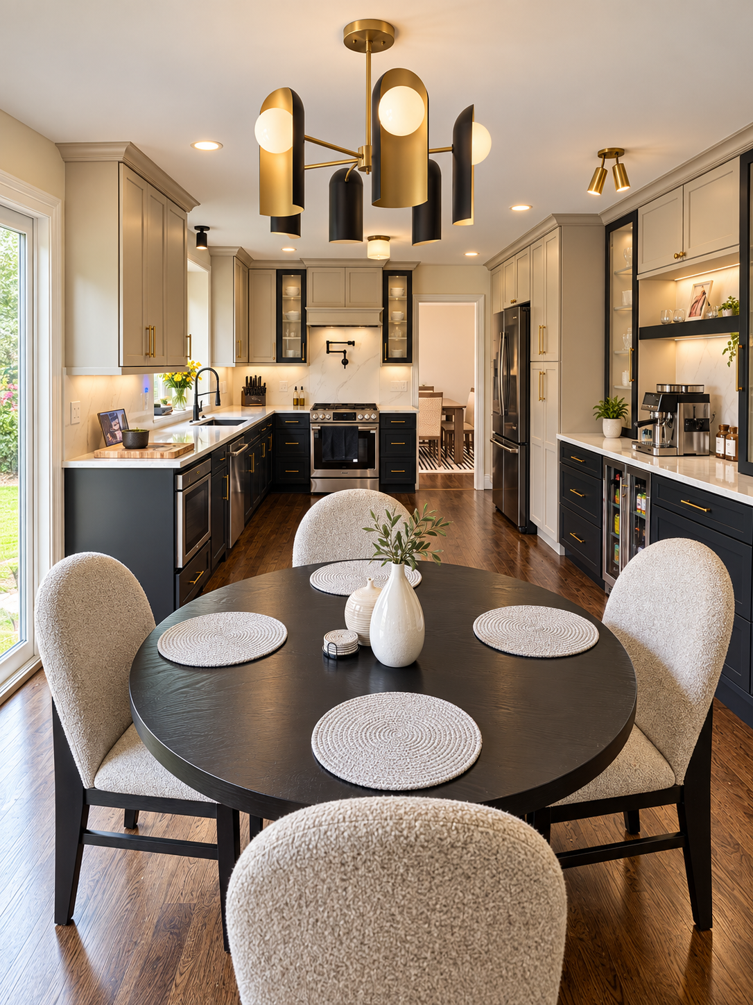
There was nothing particularly wrong with this kitchen.
And that may have been the problem.
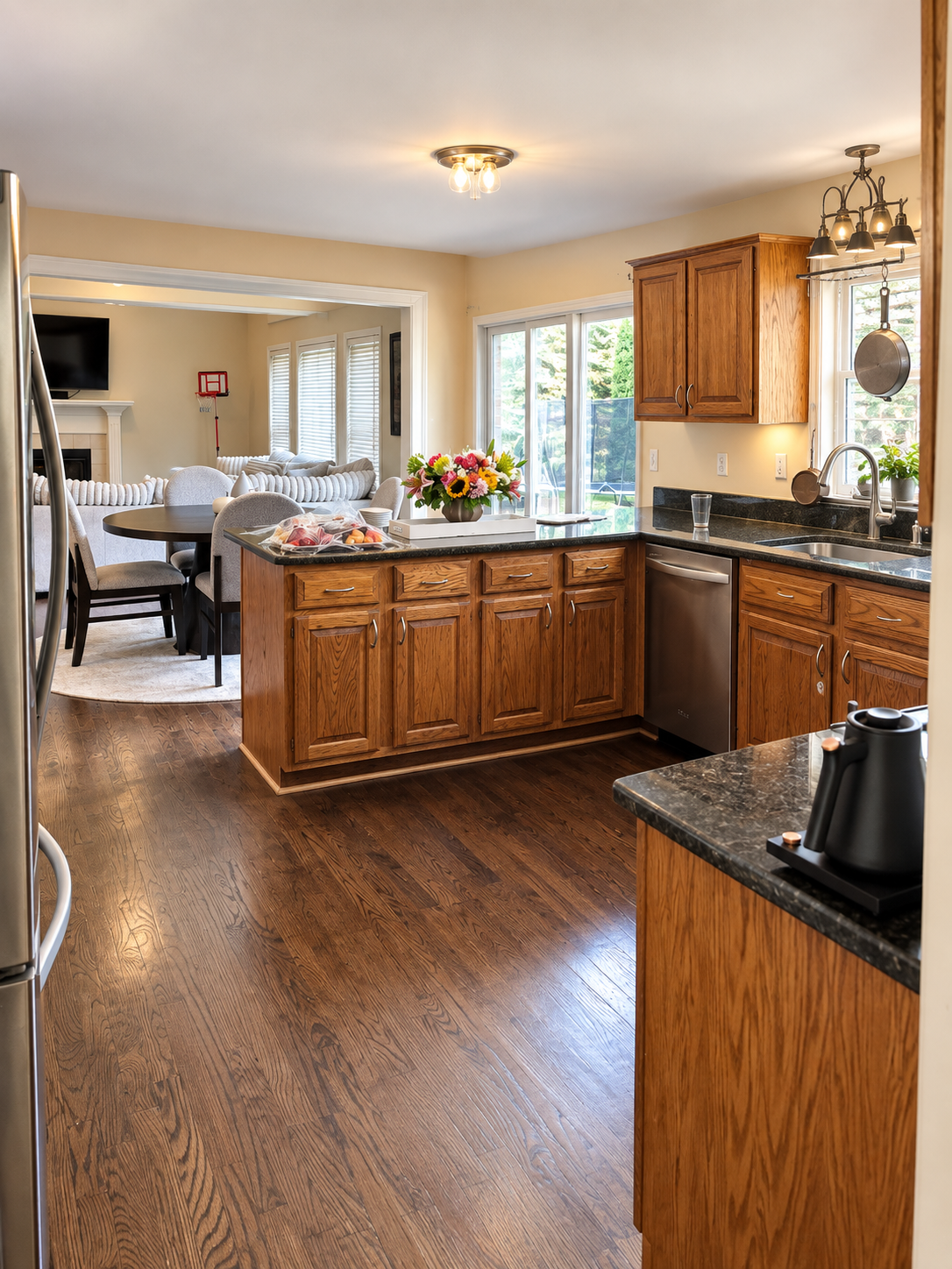
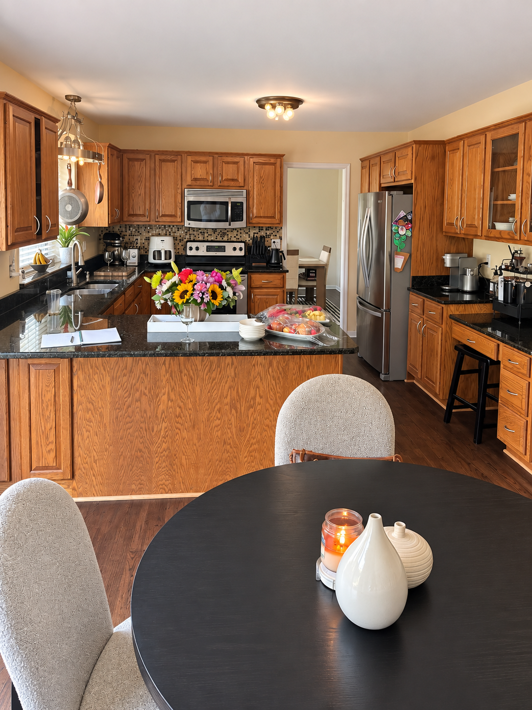
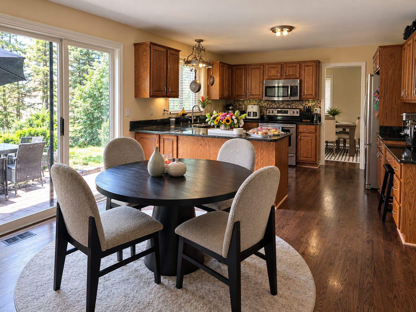
The home sits in a lovely Michigan subdivision, built about twenty years ago, when warm oak cabinetry, dark granite countertops and over-the-range microwaves were nearly standard issue in new construction. The kitchen was functional and well maintained.
It simply had very little to say.
That distinction matters to us.
A kitchen can contain everything it is supposed to contain and still feel disconnected from the person who lives there. And because kitchens occupy such an important place in the life of a home, we think they deserve more than that.
They should have a point of view.
START WITH THE PERSON, NOT THE PALETTE
Before there was a paint color, a cabinet drawing or a light fixture, there was our client.
She is a modern professional, a mother of two, smart and discerning, with a demanding career and a genuine love of entertaining. Her home isn't simply where she retreats at the end of the day. It is where friends gather, cocktails are poured, meals are shared and family life happens.
Once I understood her, I could see the kitchen almost immediately.
Sophisticated. Modern. Pulled together. Confident without being showy.
In a funny way, she and her finished kitchen look alike.
And perhaps that is one of the best compliments I can give a completed project.
Good design doesn't begin by asking, What's trending?
It begins by paying attention.
How does someone live? What do they notice? What do they value? How formal, or informal are they? Do they entertain? Cook? Gather? Do they want visual quiet at the end of a demanding day, or do they come alive around color and pattern?
There is a kind of shorthand that develops when you truly connect with a client. You begin to understand their way of being in the world.
I got her.
Just as importantly, she has a sophisticated eye of her own. She trusted me with tremendous creative freedom while remaining an engaged collaborator throughout the process. That combination: trust, communication and a shared visual language—made the project particularly rewarding.
QUIETING THE ROOM
The transformation began by removing some of the visual noise.
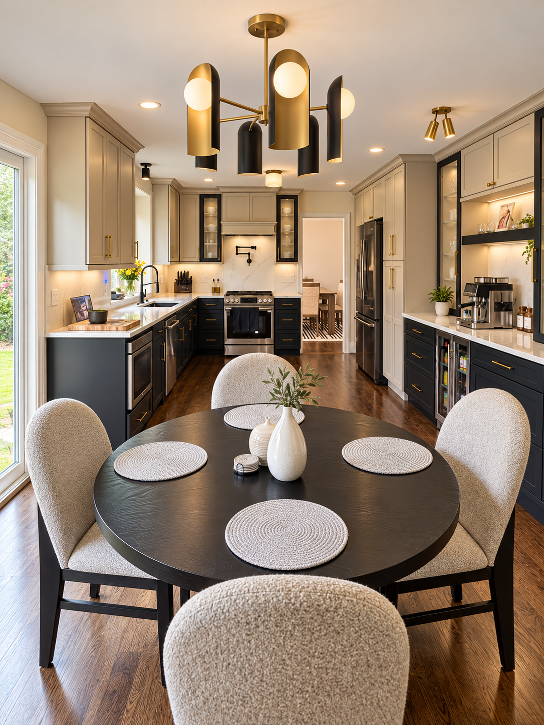
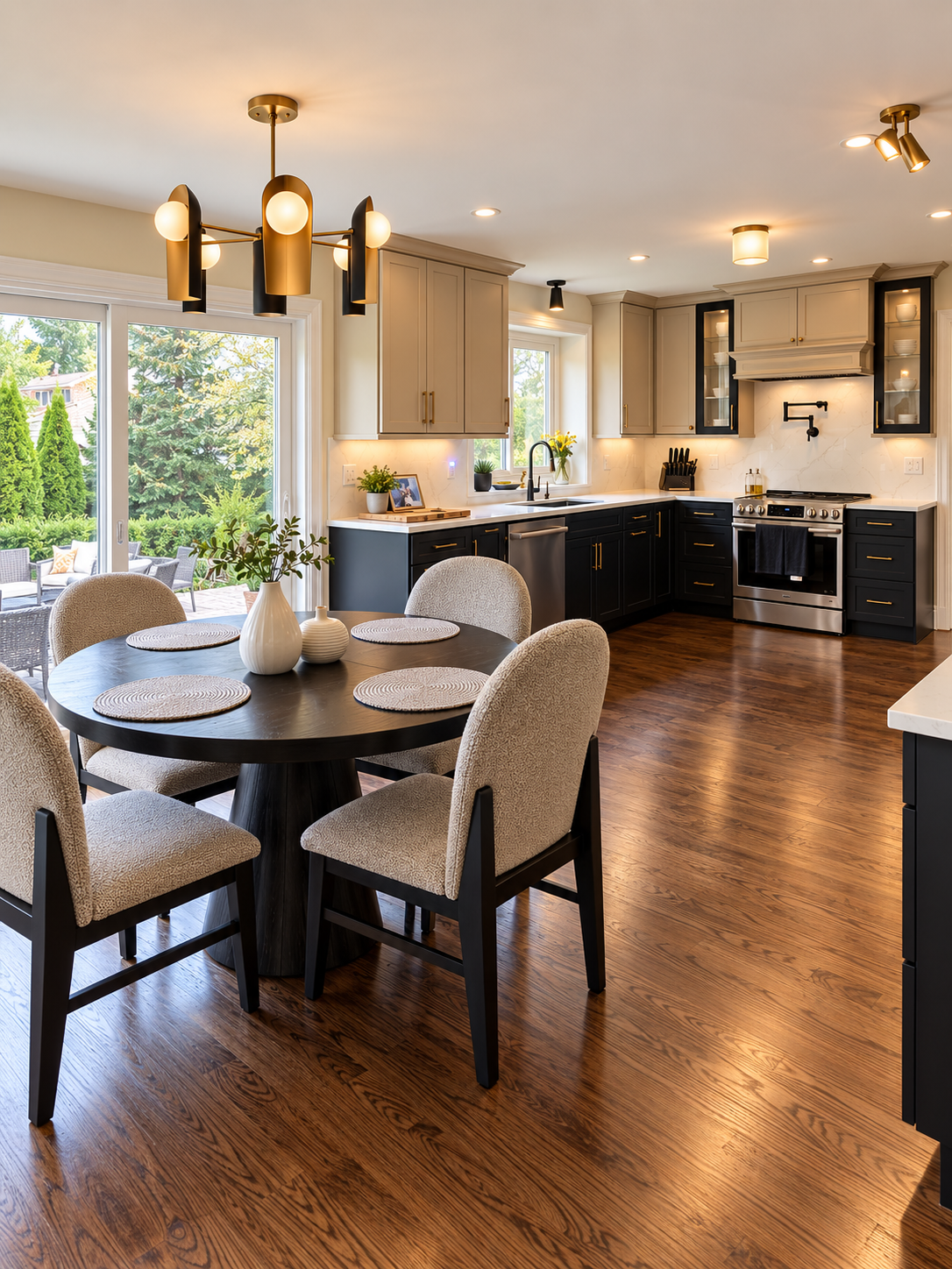
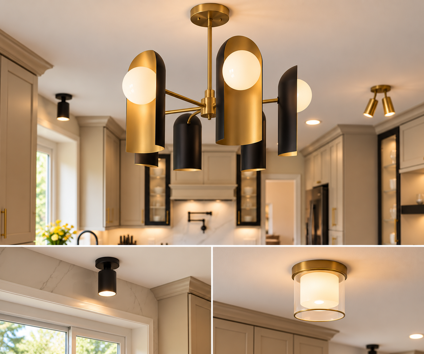
We muted the walls and added more lighting to bring warmth and a color shift to the space. Four inch recessed cans diffuse light throughout the whole space while task lighting and a lovely chandelier change the entire feeling of the kitchen.
Those decisions changed the atmosphere of the kitchen before the cabinetry was even considered.
Against it, the cabinetry became the architecture of the room.
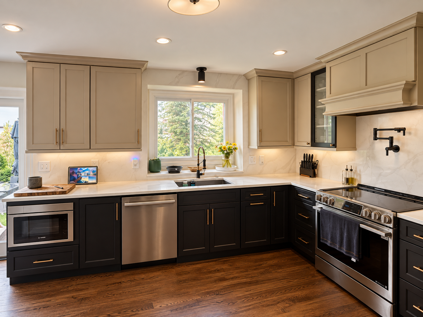
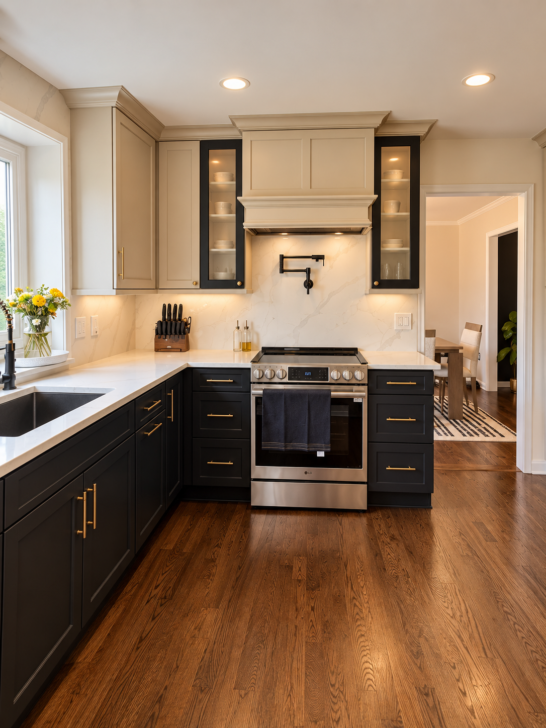
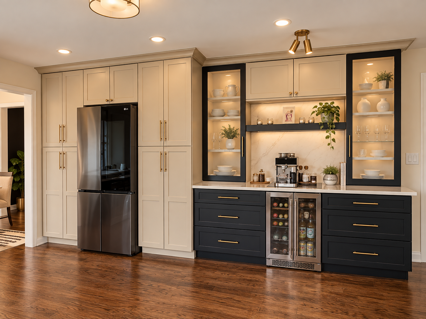
The upper cabinets were painted Benjamin Moore Upper West Side, while the lower cabinetry was grounded in Benjamin Moore Onyx. Rather than relying on a dramatic pattern or a busy stone to create interest, the palette gets its strength from contrast, proportion and repetition.
The result feels modern, but not cold. Tailored, but still comfortable.
Slim brass Kingsmill pulls by Top Knobs provide the jewelry. Their clean lines reinforce the simplicity of the cabinetry while the warmth of the brass keeps the composition from becoming severe.
These are relatively quiet decisions individually.
Together, they created a completely different room.
LET THE FUNCTIONAL THINGS DISAPPEAR
One of the most important changes was also one of the least decorative.
The microwave that once occupied the space above the range was removed and relocated into the cabinetry as a drawer unit.
Suddenly, the cooking wall could breathe.
Instead of an appliance becoming the visual centerpiece, the range, hood, cabinetry and stone could read as a complete composition. A new induction range added another layer of polish while giving the homeowner the performance and energy-conscious technology she wanted.
This is something we return to often in kitchen design: function should be carefully considered, but it doesn't always need to announce itself.
Sometimes the best design decision is deciding what not to make prominent.
TURNING AN EMPTY WALL INTO A DESTINATION
Across the room was a long wall that previously contributed very little to the kitchen.
We saw an opportunity.
It became a dedicated coffee and wine bar, with tall cabinetry, illuminated glass-front cabinets, generous drawers and beverage refrigeration. What had essentially been leftover space became one of the most useful and visually distinctive features of the room.
Morning coffee lives here.
So does the bottle of wine opened when friends arrive.
By moving those rituals away from the primary cooking area, the new bar also changes how the kitchen functions when the homeowner entertains. Guests can help themselves without competing with the person preparing dinner.
That is the kind of luxury we value: not simply expensive materials, but a home that anticipates how people actually live.
AND THEN THERE WAS LIGHTING
The lighting deserved to have a little fun.
Against the controlled palette of putty, black, white and brass, the sculptural fixtures introduce personality. They are bold enough to command attention without overwhelming the architecture around them.
They also demonstrate something we believe strongly: a room does not need many statement pieces.
It needs the right ones.
The fixtures provide exactly the amount of tension the kitchen needed. Without them, the room would still be handsome. With them, it becomes memorable.
THE DETAILS BETWEEN THE BIG DECISIONS
Renovations are rarely as effortless as finished photographs make them appear.
There are measurements to resolve, alignments to correct and details that sometimes need to be done again because "almost right" isn't right.
We were fortunate to work with tradespeople who understood that.
When something needed adjusting, they adjusted it. When a detail could be improved, they were willing to improve it. That willingness matters enormously. Good design on paper only becomes good construction when the people executing it care about the outcome.
They did.
And they deserve credit for it.
THE KITCHEN WAS ALWAYS THERE
Looking at the before and after photographs, the difference is dramatic.
Yet much of the underlying room remained recognizable. The transformation did not require making the kitchen unrecognizable simply for the sake of change.
What changed was its point of view.
The original kitchen reflected the decisions commonly made when the house was built roughly two decades ago. There was nothing inherently wrong with those choices. They simply belonged to another moment and, more importantly, they didn't say very much about the woman living there now.
The renovated kitchen does.
It feels composed. Grown-up. Welcoming. A little glamorous. Highly functional. Comfortable entertaining a room full of people and equally comfortable hosting one quiet cup of coffee before a demanding workday begins.
That is why designing kitchens is about much more than selecting cabinets and countertops.
We have been thinking about this again recently while revisiting the kitchen design for our Seminary project. Different house. Different client. Different architecture. But the question remains remarkably similar:
Who is this kitchen for, and how should it feel to live here?
We don't believe the answer should be the same from one house to the next.
A successful kitchen isn't simply beautiful.
It belongs to someone.
And when you get that part right, the room begins to say something.
This one finally had plenty to say.